BRAND OVERHAUL
TAHOE TRUCKEE COMMUNITY FOUNDATION
Working as an in-house designer for the Tahoe Truckee Community Foundation, or TTCF, I was given the opportunity to completely overhaul their brand. This included many of the usual updates to the logo, business cards, and letterhead, but it was also a chance to update and unify many of the organizations that operate under the umbrella of TTCF. This was a complex process where I worked closely with the TTCF CEO, Stacy Caldwell, to keep the individual identities of each organization while making their affiliation with TTCF clear.
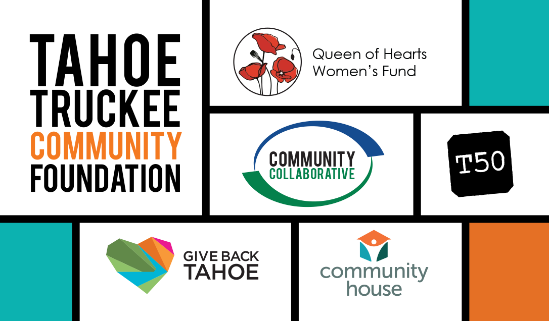
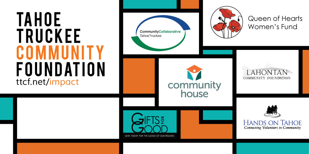
During the early stages of the brand overhaul, we settled on a Mondrian theme. The reasons for this were two-fold: first, it allowed TTCF to compartmentalize each group while including them within a larger theme; and second, the colorful boxes symbolically represent the many different parts of the region and community that TTCF serves.
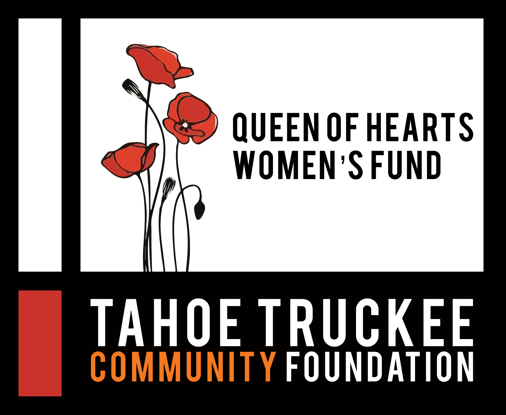
I developed the complete look and feel of Tahoe50 and the redesign of the Community Collaborative of Tahoe Truckee logo and website, as well as updating both the Give Back Tahoe and the Queen of Hearts logos.
TOP PICK
FULL GRAPHIC STANDARD | 2014 ANNUAL REPORT
QUICK LINKS
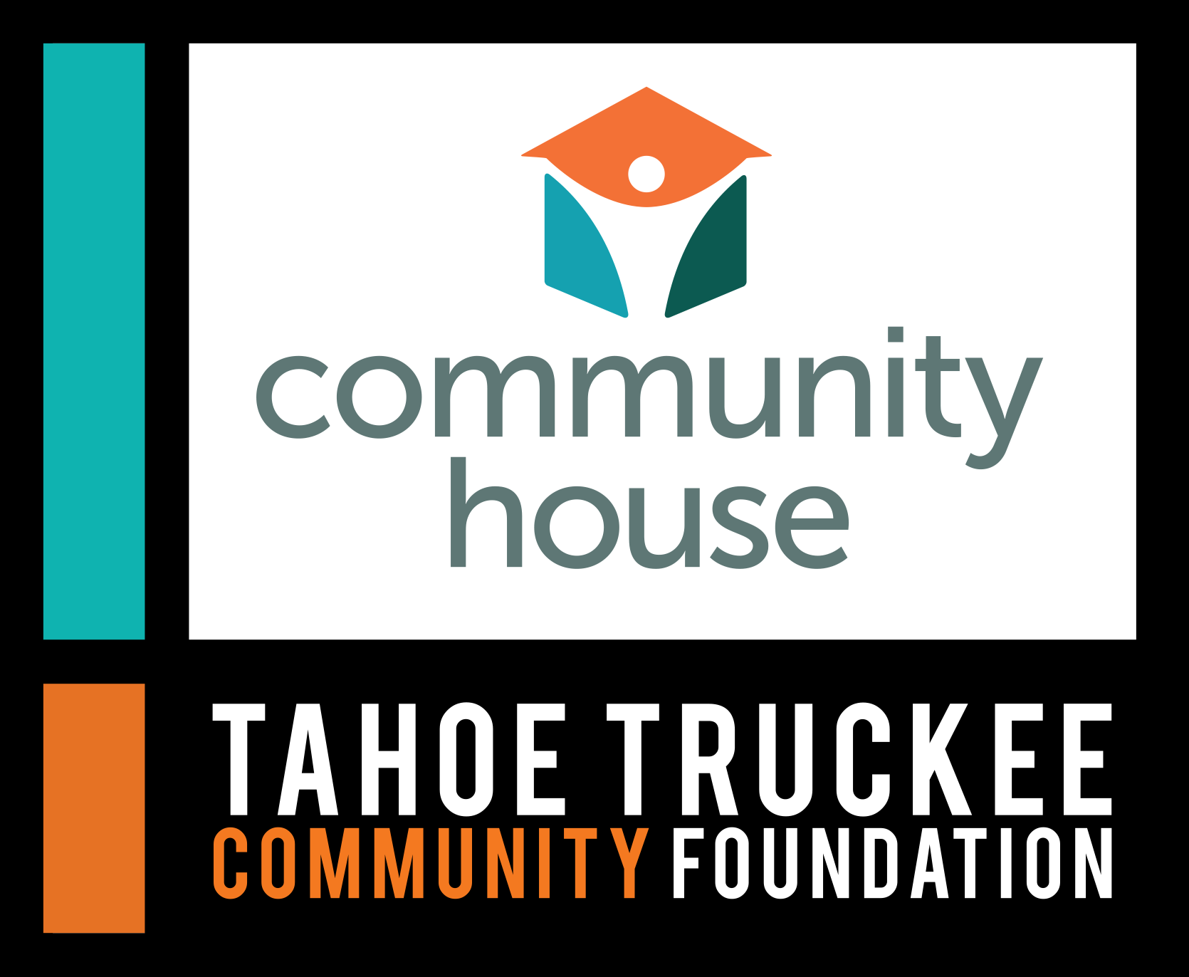
MAIN BRAND
LOGO
OLD LOGO
BUSINESS CARD
LETTERHEAD
BRAND COLLATERAL
ASSOCIATED BRANDS
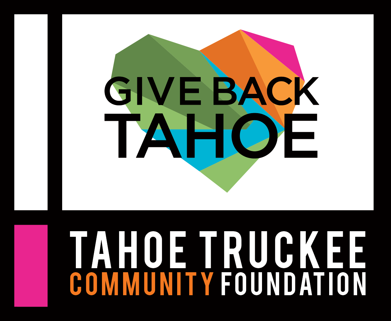
GIVE BACK TAHOE
Give Back Tahoe was a fledgling campaign effort when I started working with TTCF, but in the fall of 2014, there was a concentrated push to create a holiday fundraising campaign for regional nonprofits.
To prepare for this push, I redesigned the Give Back Tahoe logo. My priority was to clarify the logo so that it would actually resemble a heart with mountains and a river—significant and appropriate for the Tahoe area—while maintaining the origami style that the original logo had featured. After several iterations, I located the text in the center of the logo so that the bold message cannot be missed.
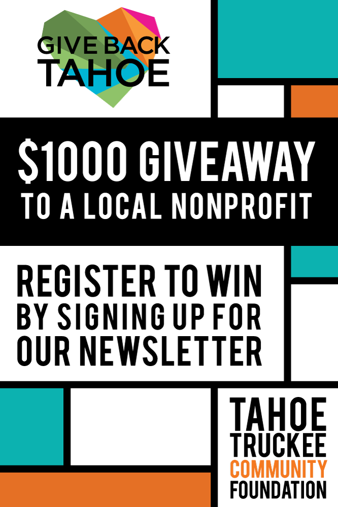
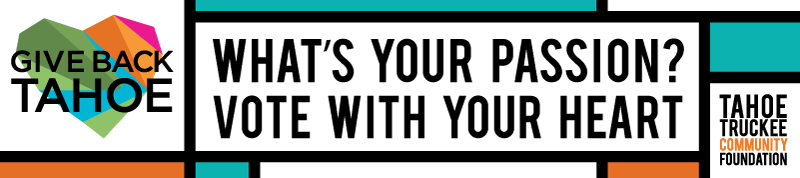
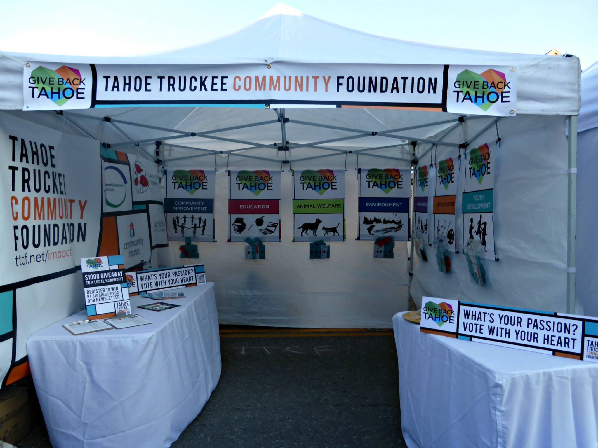
Since the holiday push, Give Back Tahoe has become the primary action campaign for TTCF and their effort to engage people in "street level philanthropy." I have designed many pieces of collateral for the campaign—which includes a weekly page in the local newspaper—and the following photo of the TTCF Give Back Tahoe Booth shows some of my designs in action.
LOGO
OLD LOGO
BRAND COLLATERAL

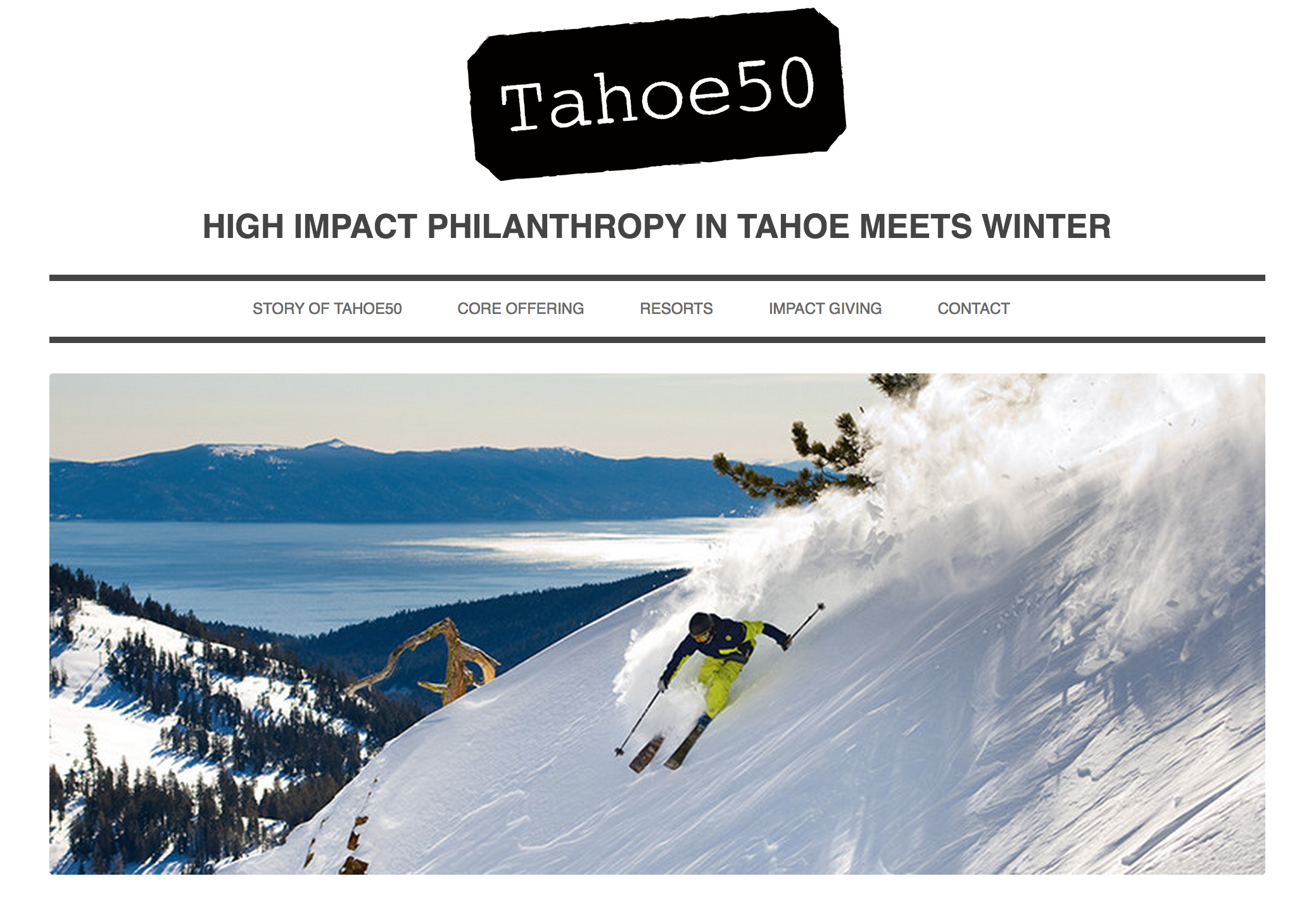
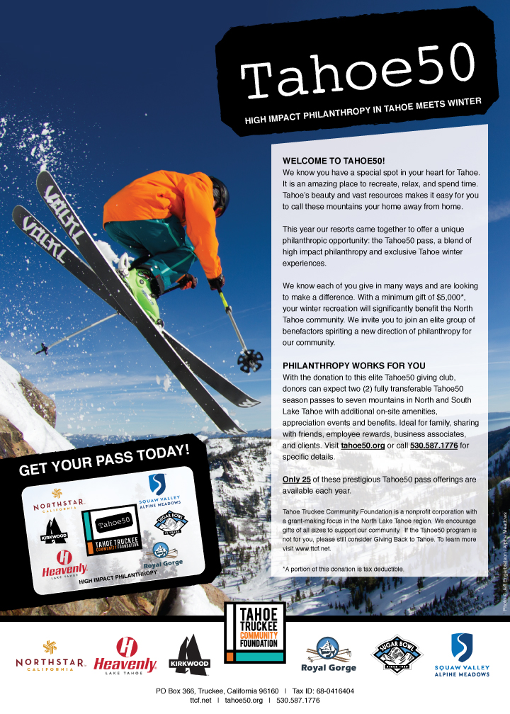
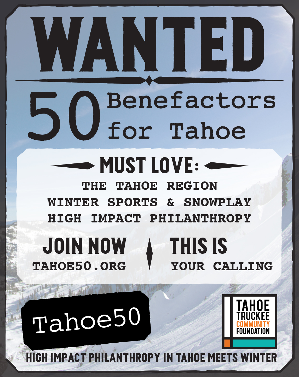
TAHOE50
While working with TTCF, I was responsible for the visual creation and development of the Tahoe50 campaign, and its associated collateral, including the brand identity and website. Tahoe50 is an evolving effort to target individuals who are capable of becoming impact donors in the North Tahoe region. With a substantial gift, individuals can receive a number of perks detailed on the website, including a ski pass to seven local resorts.
The main goal in developing the identity of Tahoe50 was to convey elegance and simplicity while maintaining the rough and rustic appeal of the Tahoe area. With this in mind, the CEO of TTCF and myself looked to Assay Office Marks as a starting point for the logo. For the website, we wanted to continue the theme, and elected to keep things very simple. This allows the beauty of the Tahoe area to speak for itself without needing to compete with any background noise. I adapted a WordPress theme so that TTCF can continue to update the information for the Tahoe50 campaign as it changes.
LOGO
WEBSITE
MAGAZINE ADS
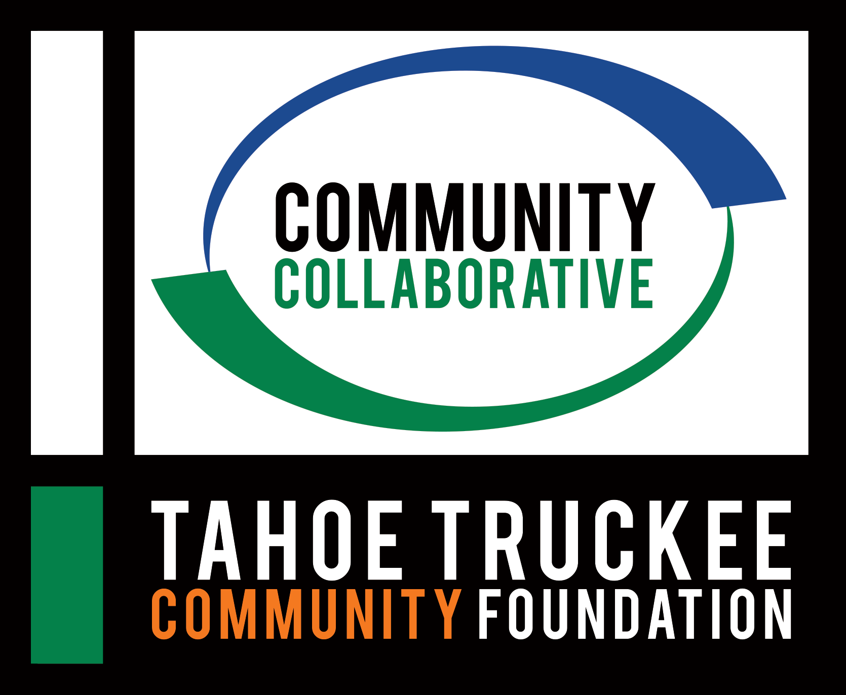
COMMUNITY COLLABORATIVE
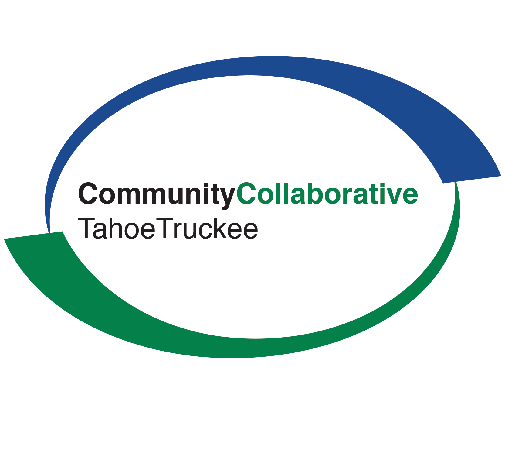
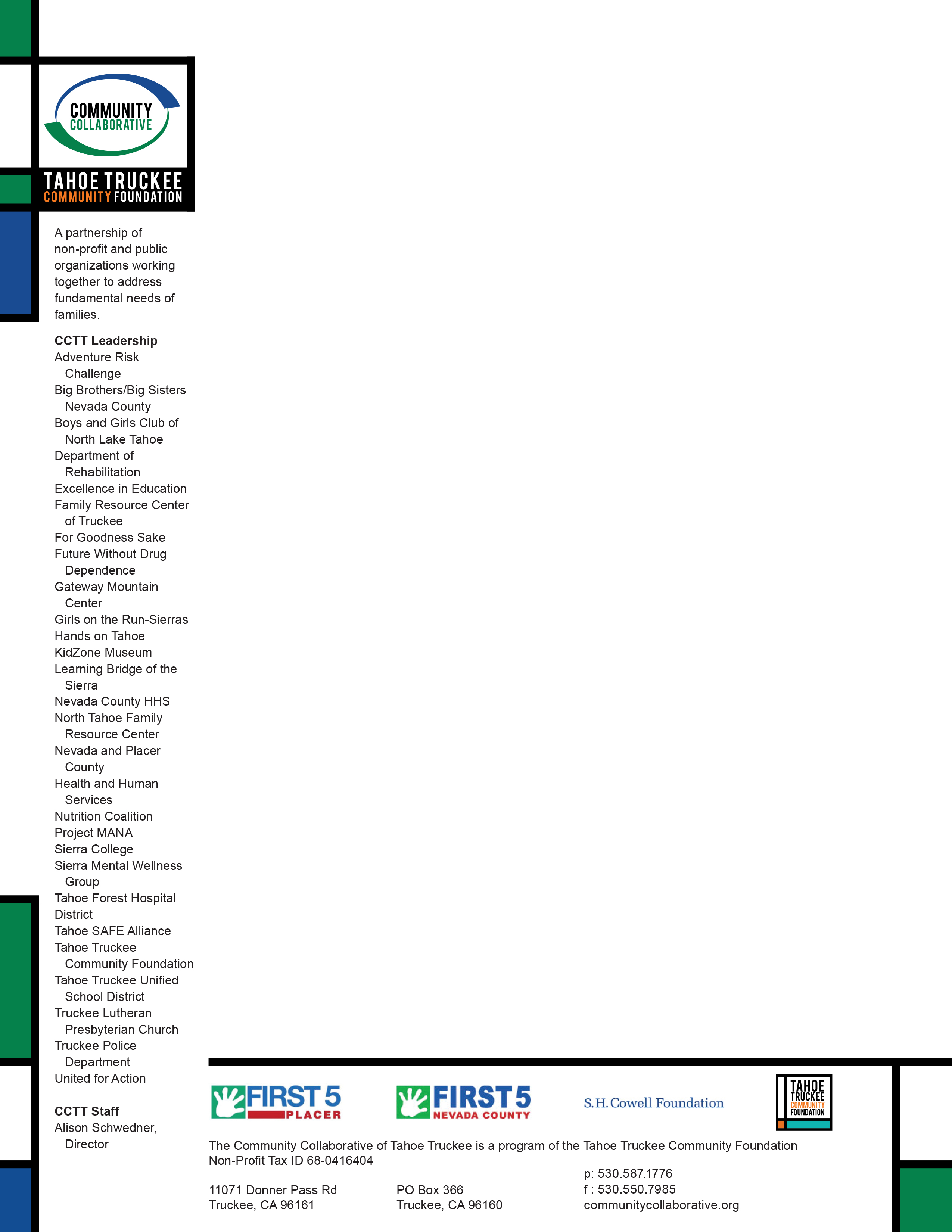
The Community Collaborative of Truckee Tahoe, or CCTT, is a partnership of over 45 nonprofit and public organizations that work to serve the needs of the Tahoe-Truckee region. Though CCTT is older than TTCF, their missions are similar enough that TTCF brought CCTT under its banner. However, the Collaborative still remains semi-autonomous, with its own director, Alison Schwedner.
While doing work for the TTCF, I was asked to redesign the very aged logo of the Collaborative. This was admittedly a long process, with many iterations, as Ms. Schwedner needed to get buy-in from the many members of the Collaborative. I decided early on that keeping the changes simple was the best option, and we ended up with a clean, modern logo, that still pays tribute to its heritage.
After the logo, I went on to update their website—putting much more emphasis on hierarchy and structure— as well as developing a graphic identity in the same vein as my work for TTCF.
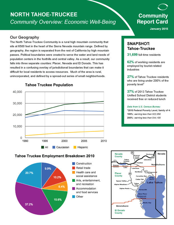
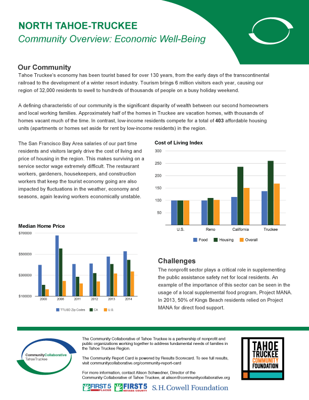
The other major piece that I worked on for CCTT was their Community Issue Briefings. These feature five focus areas, including Education, Grade-Level Reading, Health, Drug Awareness and Prevention, and the pictured Community Snapshot. These Issue Briefings have been well-received throughout the community because of their visual, easy-to-read style.
LOGO
OLD LOGO
BUSINESS CARD


LETTERHEAD
ISSUE BRIEF